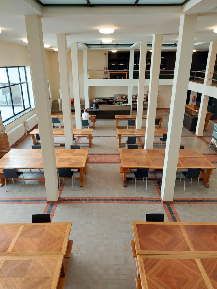
Lines and Colours
‘In addition to the line, colour is van de Velde’s second aesthetic medium’, a critic noted as early as 1900. This reading rooms proves this statement.

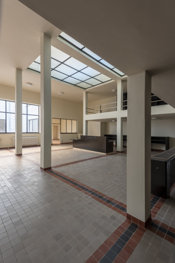
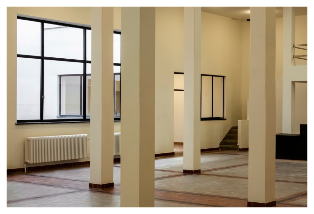
Before van de Velde entered the field of architecture and design, he was a painter. His past as a painter has played an important role in his mastery of colours. Take a look at the floor of the Reading Room for Special Collections. Van de Velde had already applied the harmonious use of two colour tones, edged with (black) bands, as a principle in his earlier work, for instance in the sanatorium he designed before the First World War. That was in a more flamboyant Art Nouveau style. Here it fits into a tighter rhythmic design. Incidentally, the ceramic tiles come from Welkenraedt; because of the war, only Belgian materials could be used for the interior finishing.
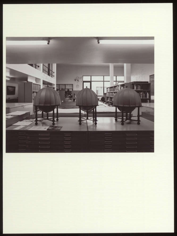
The beauty of this reading room has only recently been discovered. For a long time this room was split into two and used as a depot, where especially the maps and precious prints were kept. The beautiful floor was covered with library furniture and towering bookshelves. The restoration of Robbrecht and Daem architects has transformed the two depots into one reading room.
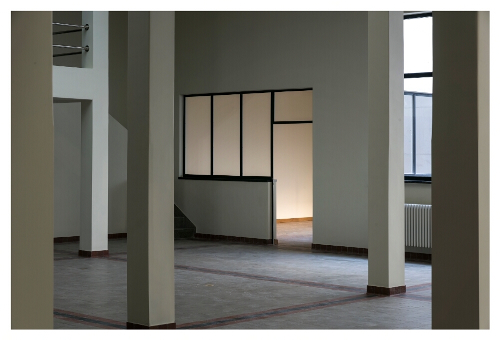
In the far corners of this reading room, as if in mirror image, there are two offices: they were intended for the curator of the former Reading Room for Maps and former Reserve Room.

